Welcome to the Centre of W6
The St Paul’s Centre in Hammersmith
It’s hard to imagine there’s a place quite like the St Paul’s Centre anywhere else in London – let alone in Hammersmith.
You could say it’s where two buildings and two communities meet. The Centre itself is a stunning RIBA award-winning building completed in 2011. Adjacent to it is an equally striking Anglican church with a history that dates back four centuries.
Together, St Paul’s Hammersmith is greater than the sum of its parts. And what was needed was a print piece that communicated that – by spelling out its offerings, and by opening its doors to a complete cross-section of the local community.
Telling a story of surprising flexibility
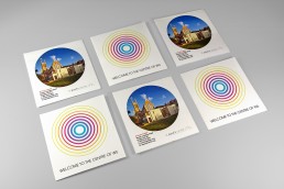
With its two-storey Atrium, the Centre is a light-filled oasis at the heart of W6. We wanted to convey this sense of light and space… and also bring home its commitment to being at the very centre of the community. This we did with bright colours and simple concentric circles.
Knowing we needed to both inform and surprise people, we did two things.
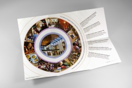
Having spelt out the three primary offerings (Café, Meetings and Events) in a ‘first reveal’ spread, the piece then opens up to convey the sheer diversity of what occurs in this one place. With a single visual collage.
We also designed the front and back of the piece to be interchangeable. To make sure different visitors would actually pick it up, and spread the word.
ClientSt Paul’s Centre HammersmithServicesMarketing collateral

